Designing Our New Website
You've no doubt noticed we've made some changes around here lately. Over the last several months, we have been working behind the scenes to construct what you see today: a brand new website for Center for Natural Healing! We are so excited to bring you this new site for many different reasons, from the brighter and more responsive, modern design, to the ease with which we can now make fast changes to the site to bring you new content more frequently. But perhaps the most exciting aspect of this new website is its completely home-grown nature. This entire site was a collaboration between Dr. Griffin and his son, Connor Griffin (who's writing this blog post).
Color and Iconography
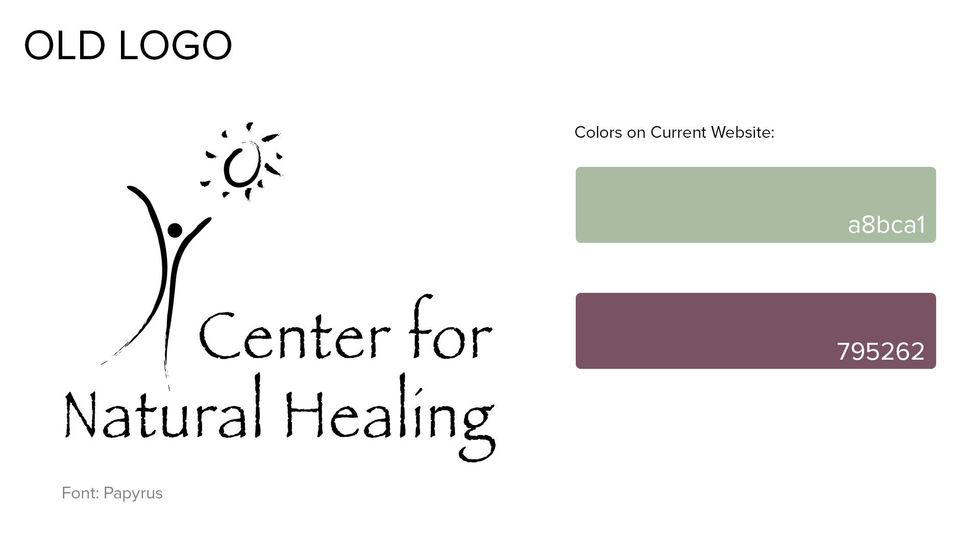
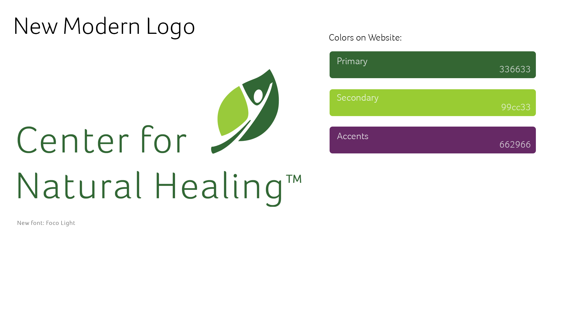
Bright, energetic use of color is a huge part of the design of this new website. Two years ago, I approached my father with a bold new color palette for his business. Gone were the faded pastel green and purple of the past, and in their place were vibrant, fresh colors that breathed new life into Center for Natural Healing, while feeling like a logical evolution of the existing iconography.


The darker primary green is used for headings and important text. The brighter secondary green for highlights and variation (such as in the footer of the site). Our purple accent color, which does not appear in the logo itself but complements the green nicely, is used to, well, accent things! Buttons are often purple on the site, to call attention to them.
Our primary font on the site is the official C4NH font: Foco, which was selected because of the subtle curves on the ends of some of the letters, which suggest the shapes of leaves, complementing our logo.
Layout and Design
Our new website has a simplified navigation menu, focusing on the core things people are visiting our site to do: Learn and Connect. We've added a dedicated destination for New Patients to get all of the information they need to get started (including forms), and we've moved information about the services we provide under a single "Services" tab. We think this new site makes it easier than ever to find what you're looking for, quickly.
Photography
In preparing this website, we worked with Neuway Media to take some brand new, beautiful, high resolution photos of Center for Natural Healing. This way, you can see every pore on Dr. Griffin's face (which I'm sure he loves...) and get a really great idea of our offices and the comfortable, relaxing atmosphere we provide. We think these photos have turned out great, and really help bring the new site to life.
Final Thoughts
We've been hard at work preparing this new website, and we hope that our work shows in the thoughtful design and helpful information it contains. Perhaps most excitingly, now that we've moved our website onto a new platform, it is easier than ever for us to update it! This means that Dr. Griffin himself can log onto the website and create new blog posts, edit content, or even add new pages whenever he needs to. So you can be sure that this website is always the best place to find the latest news and information at Center for Natural Healing.


